


Stoop users will be afraid to leave their Stoops
Why the “podcast app for newsletters” is one of the first major pickaxe-in-a-gold-rush plays in the booming newsletter economy.


A song to read by: “Closer to You,” by Amo Amo
What I’m reading: “The Passion Economy,” by Adam Davidson
Specs on Stoop
When I spoke with Justin Duke last week, he casually mentioned something that ground my brain to a halt.
“People don’t love newsletters, they love being able to handpick content and then read it without an algorithm getting involved,” said Duke.
He said that email is inherently feature-poor, i.e. you can’t do much with it, which people overlook because it has always been around and it has always been feature-poor. You can reply to an email, store it somewhere, forward it, or delete it. That’s about it.
Sharing an email on social media is a pain, and there is no “discussing” an email. Plus, for newsletters, replying is kind of creepy. (Not so with Medialyte! I love my reply guys, gals, and non-binary pals, and honestly love feedback, so fire away.)
Duke then mentioned an app called Stoop, which he explained was a product trying to take what people love about email and then add some features to improve the newsletter experience. Intrigued, I decided to check it out.
After playing around on the app for a few days, I began to jot my thoughts down into my Notes app, which slowly turned into a product review. So, below is a breakdown of Stoop, divided into sections with pros and cons segments.
User feedback: The moron’s moment of glory
I had to do a fair bit of user feedback in grad school and at Subtext, so I have a little bit of experience with parsing through software, but I am no expert. I am also fully aware, as someone who has been on the receiving end of product feedback, how frustrating it can be to receive criticism from someone who has the luxury of overlooking everything an app does right only to point out the few things it does less than perfectly.
Still, I have always considered user feedback to be one of the most beautiful parts about the agile design process.
Brilliant, genius software developers hand an incredibly complex app to a blockhead off the street and ask for their thoughts.
This moron (in this case, me) says things like, “I don’t like how the click thing and the swoosh thing make beep noises. I think the click thing should make a ‘cha-ching’ noise and the swoosh thing should make a ‘whooosh’ noise.”
And then the engineers write this drivel down!! And sometimes even use it!!
Honestly, the exchange is egalitarian in a way that you rarely see in the world. This is driven by the fact that the two parties have a shared goal: Developers want to make a product that people will want to use, and customers get to help shape the way a product intended for them turns out. Praxis!
So, enjoy! And if you are feeling frisky and have some time on your hands (time! Yes, I have plenty of time!) then download Stoop and give it a test drive yourself.
Note: My review deals exclusively with the Stoop mobile app, not its desktop version, which I think is in beta. When you use the desktop version, the differences between Stoop and a normal email inbox are subtler. On desktop, it feels more like your Stoop inbox is just a separate email that you’ve set up exclusively to house newsletters. (In fairness, I know that some people do this — shout-out Ju Park! — and there are worse inbox hacks.) Still, I don’t think that’s what Stoop is going for.
Main takeaways
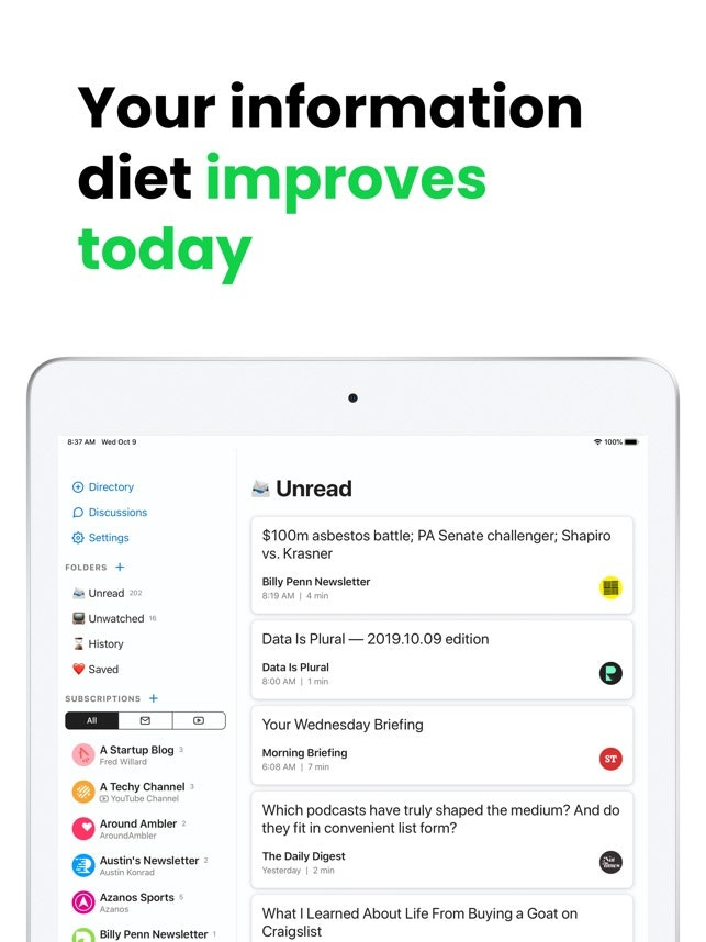
Stoop highlights newsletters in a big way. As Substack drives a newsletter renaissance, companies like Stoop that can substantially improve the email-reading experience stand to benefit. Stoop is a smart product that’s gotten in the newsletter game early, which gives them a huge first-mover advantage.
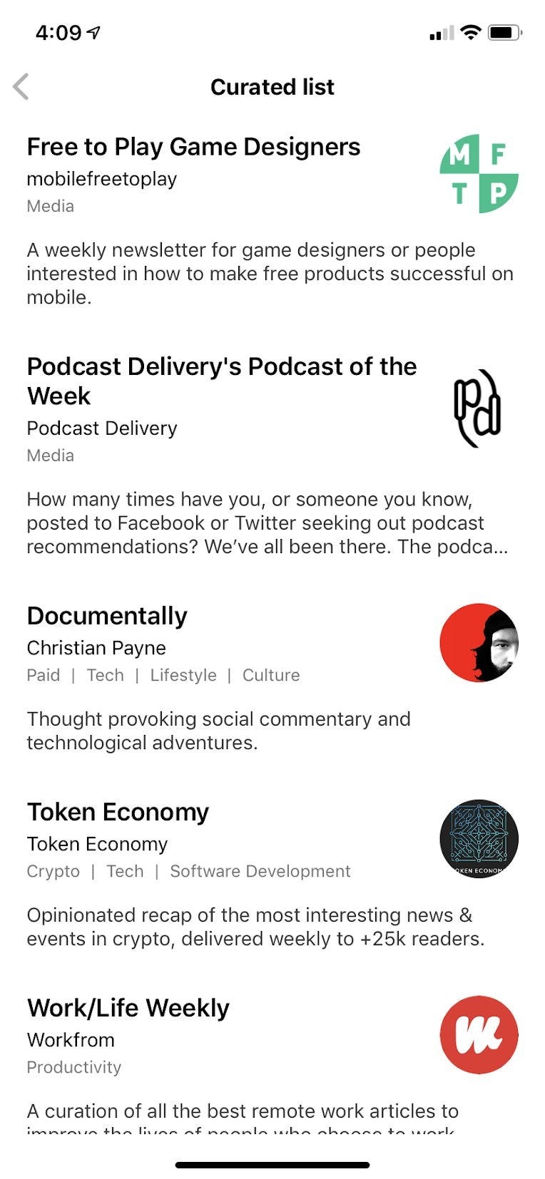
The discovery features are a game-changer. The single worst thing about newsletters is that finding new ones is a challenge. Stoop lays out hundreds of newsletters in intuitive categories, making it easy to sign up for dozens of them and quickly find yourself using the app more and more.
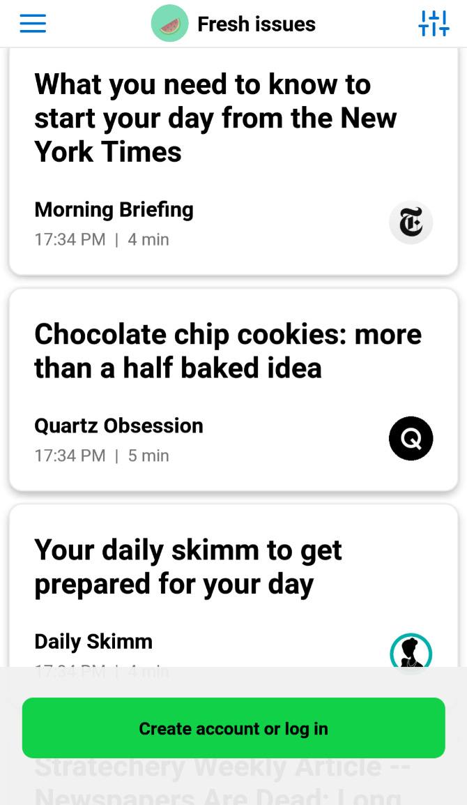
The aesthetics have room to improve. Think about it: Every newsletter has its own format. Some have a lot of pictures, some are only text, some have sans-serif font, some are written in green Helvetica. This heterogeneity of style works well in a vacuum, but the juxtaposition of one, differently styled newsletter after another quickly turns idiosyncrasy into tedium.
General
Pros
Right now, email inboxes are a mix of “good” and “bad” emails –– “good” meaning fun or containing information you want, “bad” meaning work and bills. Having all your “good” emails in one place makes checking Stoop feel like a treat, whereas normal email feels like navigating a minefield.
The “ironclad” unsubscribe is a smart feature to highlight. There is nothing more annoying than unsubscribing from a newsletter, only to find the next issue in your inbox the next morning, or the next week. If Stoop’s unsubscribe really is infallible, that alone is reason to use the app.
They might prefer I not draw attention to this feature, but I appreciate an app that makes it easy to quit. The “Switch from Stoop” feature offers a built-in evacuation protocol, promising to switch your subscriptions from Stoop to a different email address.
Cons
Lock-in will be a serious challenge for Stoop. If you’re anything like me, you’re already subscribed to more than a dozen newsletters. To have them come to my Stoop inbox, I either need to re-sign-up using my stoop email.
User experience/navigation
Pros
While the layout has a number of small flaws, on the whole it’s very navigable. Besides, Stoop’s main features — the reading of emails and discovery of newsletters — is easy to figure out, meaning the other issues are less pressing.
Cons
From the “home page,” i.e. the “unread” section, finding the “menu” is a bit unintuitive. To do so, you click the word “unread” or the icon beside it.
In general, the process of moving from section to section, or backward from inside a newsletter, can be unintuitive.
Using the language “prev” and “next” to move from email to email is a bit confusing. You hit “prev” to move to a newer email, one that more recently arrived in your inbox, and “next” takes you to an older email.
Aesthetics
Pros
The structure of the “unread” page, which acts as the de facto home page, mirrors the structure of a typical email inbox, but without most of the bells and whistles. It feels like it was designed by people who care about highlighting writing.
Large letters! Older users will love this, and frankly I didn’t hate it. Maybe words should just be larger in general?
Cons
Different newsletters have all different kinds of formats, meaning moving from one to another can give you some serious design whiplash.
Some of the newsletters’ aesthetics look like basic black HTML on white background, as bare bones as it can get.
Discovery
Pros
The “lock-in” of email is quite an obstacle for Stoop to overcome, which I touch on in the General Cons section above. But, once you start using Stoop, the layout makes finding and signing up for newsletters so much simpler that within a few days I had signed up for as many newsletters on Stoop as I had in my normal inbox. This ease of access does wonders in getting you to use Stoop more and more. Plus, when I signed up for newsletters on Stoop, I didn’t feel like I was “cluttering” my inbox; instead, I felt like I was populating my Stoop!
The shuffle feature! Nothing warms my heart like a salt of the earth, honest to god, bona fide shuffle feature.
When signing up for a newsletter, some of the newsletters make it very easy, requiring little or no information to be entered. This is the case, for instance, when signing up for the Morning Brew newsletter, and it makes all the difference.
Cons
There is no “discovery”; instead, it is called “directory.” This departure from naming norms is part of a broader set of challenges the app has with navigation.
A lot of actions that would ideally be native to the app — i.e. signing up for newsletters, viewing “an example issue” — require that you jump onto the web.
When you sign up for a newsletter, many of them require you to fill in several data forms: name, email, industry, date of birth.
When exploring a newsletter to see if you want to sign-up, readers will want to see an example. Some of the newsletters offer “view an example” and some don’t, but seeing what you’re opting into should be much clearer across the board.
Intriguing: The “presidential campaigns” curated list suggests a host of newsletters from political campaigns, such as Cory Booker, Kamala Harris, and Mike Bloomberg. President Trump and John Kasich make the list, but otherwise it’s all Democratic or Socialist Democrat, meaning the app makes little pretense at political neutrality. Likewise, Fox News is conspicuously absent, though I assume it offers a suite of newsletters.
Payment
Pros
Paid newsletters have a tag indicating that they are paid, which makes for useful sorting.
Cons
When you go to sign up for a paid newsletter, you have to enter your credit card information. And newsletters that use different payment processors — think Popular Information on Substack vs. Ben Thompson’s independent Stratechery — you have to re-enter your information.
Discussion
Pros
Once you send a newsletter to an email address, that email address remains on the discussion page, making it easy to send that person newsletters in the future.
When you forward a newsletter, you and the recipient enter into a text message-like window, making it easy to write back and forth about the newsletter that was just shared.
Cons
In that text message-like window, every time you send a “text” it sends an email. Annoying!
Without other friends on the app, the “discuss with” option is pretty limited. You can forward a newsletter to a friend’s email, but when they open it, it looks like a normally forwarded newsletter; there is no indication that it came from Stoop other than the Stoop email address.
These confused me
Unwatched
I am sensing that Stoop can also be used as a repository for videos of some kind, though in the absence of an explanation I have no idea where these videos would come from or why they’re on a “podcast app for newsletters.”
Saved
I get “saving” a newsletter, but the section offers repositories for saved “videos” and “links.” Not sure how one saves these or where they’d come from.
Some good readin’
— I read this last week, but have been thinking about it again. No good analysis of racism can overlook the sins of American Christianity. (The New Yorker)
— The improbable, continuing success of The Athletic is reason to celebrate! Befuddlement optional. (CNBC)
— The Defector Media website launched yesterday!! And they have a video of Daniel Radcliffe reading bad sports tweets? (Defector)
— And if you’re itching for another app recommendation, do yourself an actual literal favor and head to poolside.fm. Gorgeous design, amazing music — I see why the band played as the Titanic sank! (poolside.fm)